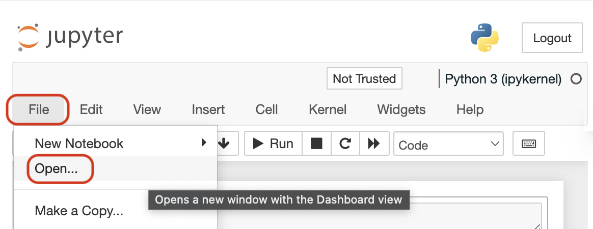
💻 Accessing Utils File and Helper Functions
In each notebook on the top menu:
1: Click on "File"
2: Then, click on "Open"
You will be able to see all the notebook files for the lesson, including any helper functions used in the notebook on the left sidebar. See the following image for the steps above.
🔄 Reset User Workspace
If you need to reset your workspace to its original state, follow these quick steps:
1: Access the Menu: Look for the three-dot menu (⋮) in the top-right corner of the notebook toolbar.
2: Restore Original Version: Click on "Restore Original Version" from the dropdown menu.
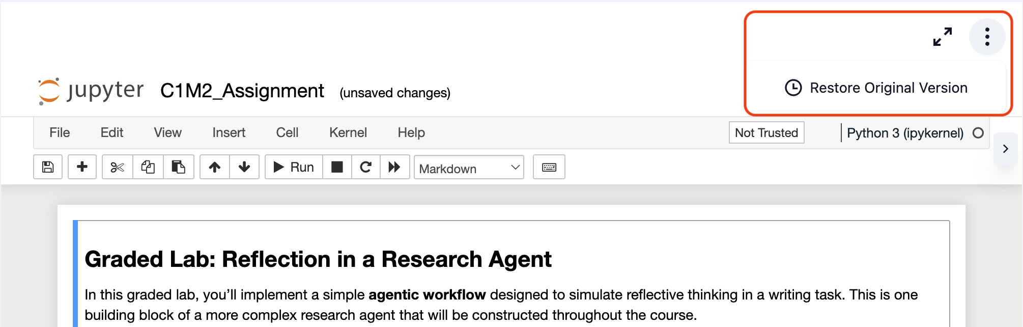
For more detailed instructions, please visit our Reset Workspace Guide.
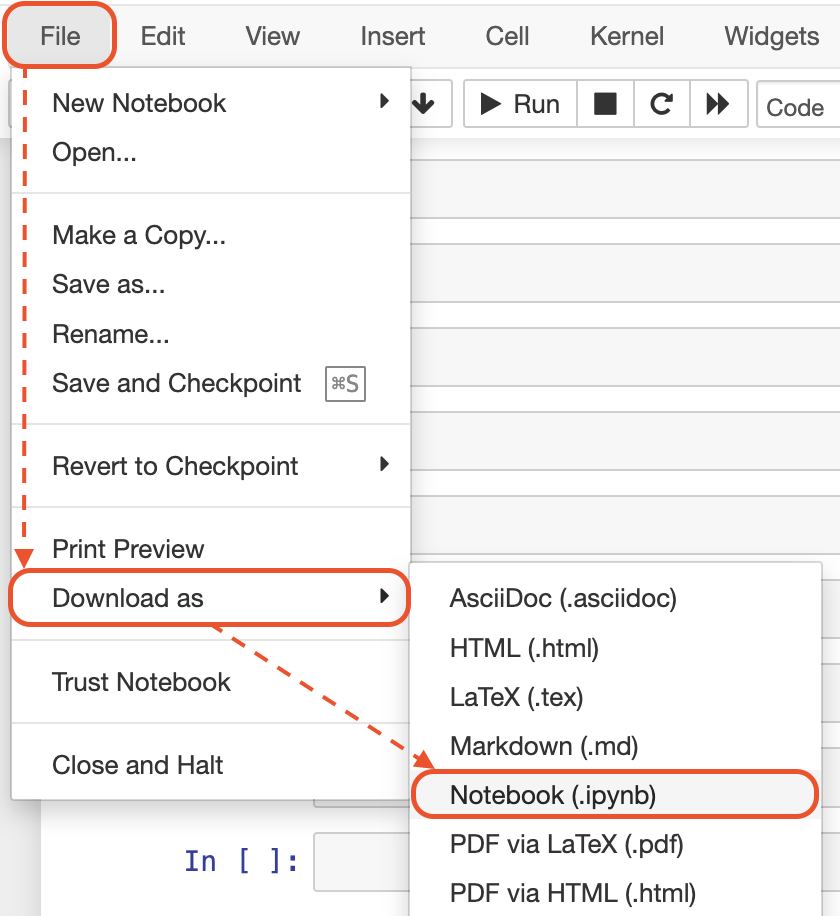
💻 Downloading Notebooks
In each notebook on the top menu:
1: Click on "File"
2: Then, click on "Download as"
3: Then, click on "Notebook (.ipynb)"
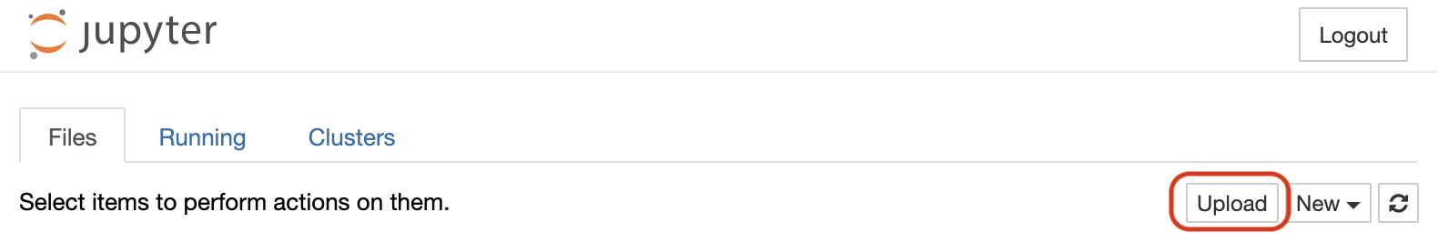
💻 Uploading Your Files
After following the steps shown in the previous section ("File" => "Open"), then click on "Upload" button to upload your files.
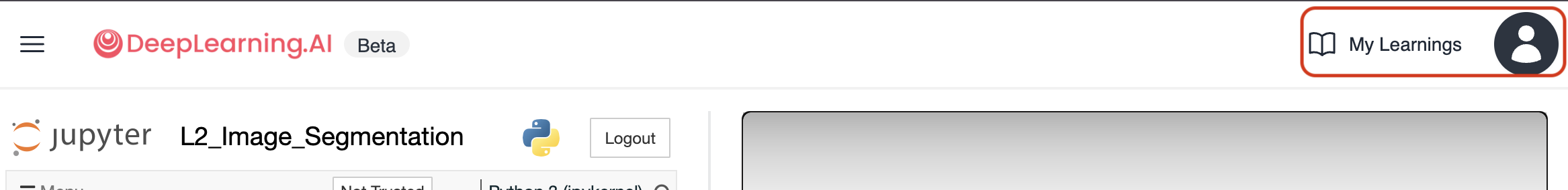
📗 See Your Progress
Once you enroll in this course—or any other short course on the DeepLearning.AI platform—and open it, you can click on 'My Learning' at the top right corner of the desktop view. There, you will be able to see all the short courses you have enrolled in and your progress in each one.
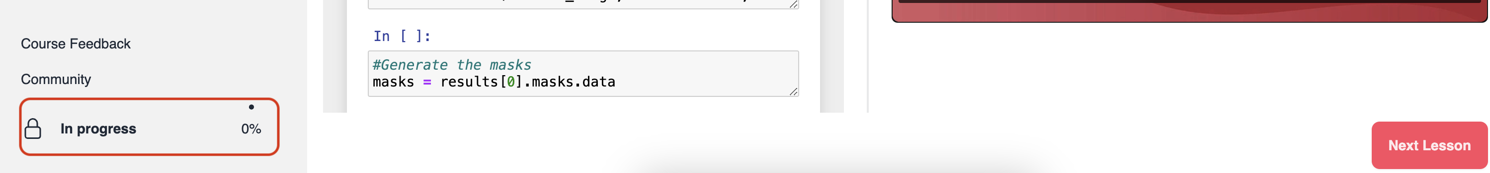
Additionally, your progress in each short course is displayed at the bottom-left corner of the learning page for each course (desktop view).
📱 Features to Use
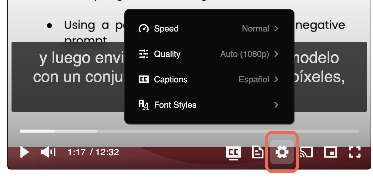
🎞 Adjust Video Speed: Click on the gear icon (⚙) on the video and then from the Speed option, choose your desired video speed.
🗣 Captions (English and Spanish): Click on the gear icon (⚙) on the video and then from the Captions option, choose to see the captions either in English or Spanish.
🔅 Video Quality: If you do not have access to high-speed internet, click on the gear icon (⚙) on the video and then from Quality, choose the quality that works the best for your Internet speed.
🖥 Picture in Picture (PiP): This feature allows you to continue watching the video when you switch to another browser tab or window. Click on the small rectangle shape on the video to go to PiP mode.
√ Hide and Unhide Lesson Navigation Menu: If you do not have a large screen, you may click on the small hamburger icon beside the title of the course to hide the left-side navigation menu. You can then unhide it by clicking on the same icon again.
🧑 Efficient Learning Tips
The following tips can help you have an efficient learning experience with this short course and other courses.
🧑 Create a Dedicated Study Space: Establish a quiet, organized workspace free from distractions. A dedicated learning environment can significantly improve concentration and overall learning efficiency.
📅 Develop a Consistent Learning Schedule:
Consistency is key to learning. Set out specific times in your day for study and make it a routine. Consistent study times help build a habit and improve information retention.
Tip: Set a recurring event and reminder in your calendar, with clear action items, to get regular notifications about your study plans and goals.
☕ Take Regular Breaks:
Include short breaks in your study sessions. The Pomodoro Technique, which involves studying for 25 minutes followed by a 5-minute break, can be particularly effective.
💬 Engage with the Community:
Participate in forums, discussions, and group activities. Engaging with peers can provide additional insights, create a sense of community, and make learning more enjoyable.
✍ Practice Active Learning:
Don't just read or run notebooks or watch the material. Engage actively by taking notes, summarizing what you learn, teaching the concept to someone else, or applying the knowledge in your practical projects.
📚 Enroll in Other Short Courses
Keep learning by enrolling in other short courses. We add new short courses regularly. Visit DeepLearning.AI Short Courses page to see our latest courses and begin learning new topics. 👇
👉👉 🔗 DeepLearning.AI – All Short Courses [+]
🙂 Let Us Know What You Think
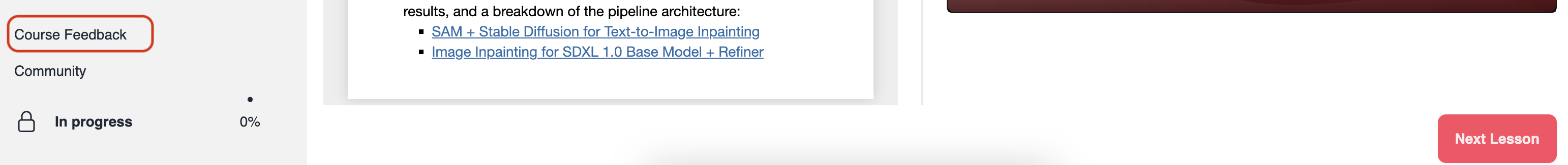
Your feedback helps us know what you liked and didn't like about the course. We read all your feedback and use them to improve this course and future courses. Please submit your feedback by clicking on "Course Feedback" option at the bottom of the lessons list menu (desktop view).
Also, you are more than welcome to join our community 👉👉 🔗 DeepLearning.AI Forum


